Can’t get your readers to sign up for your newsletter, submit an inquiry, or make a purchase? Your call to action could be to blame.
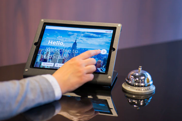
Are you struggling to get visitors to your website to actually do something? Like sign up for your newsletter, download a whitepaper, request a free demo, or even just get in contact with you?
Although there could be many factors contributing to the lack of conversions, the problem could also be something really straightforward: Ineffective calls to action.
What is a good call to action?
Before you can start writing better calls to action, it makes sense to actually know the correct meaning or definition of call to action.
A call to action, often abbreviated to just CTA, is a powerful word or phrase that persuades readers to take action.
To put that into perspective: No clicks means no leads—or far fewer than what you could be getting!
That’s why your CTA is one of the most important elements of your entire marketing campaign, since getting this wrong can literally mean the loss of potential inquiries, customers and sales. You don’t want that!
What are the different types of CTAs?
A call to action can be presented in different forms. It’s normally found as a button or a hyperlinked word or phrase but it can also be a banner, graphical component or just about any text that motivates the reader to take a specific action.
How long should a call to action be?
There’s no prescribed length to it as long as it gets the job done, i.e. it converts. Some CTAs only need one word (like ‘subscribe’, ‘book’, or ‘order’) to get the point across. Others can be a phrase or even a full sentence. The key is to find what works best for your needs.
Where can CTAs be used and where is the best place to put a CTA?
There are many places you could use CTAs. You need them on your website, landing pages, marketing emails, and even on social channels like Facebook and Instagram.
As for where to place them: You can have them at the very beginning of your page – that is at the top – or in the middle and even at the bottom of the page.
A CTA can also be placed towards the end of a blog post, as part of a welcome popup, squeeze page, in an exit-intent popup, hero image, in the sidebar, or as part of your site header / footer.
You might also like: How to develop high-converting landing pages
The best place for your CTA will ultimately be determined by testing but, in general, where you add a call to action might depend on the following factors:
- what the desired action is;
- your site / page structure;
- content;
- and page design.
Tip: A really great call to action goes beyond getting the words right. It’s also carefully designed to be visually attractive, easy to spot, and an effortless act.

How do you write a successful call to action?
When it comes to writing an effective call to action statement, these CTA copywriting tips can help to guide your choices.
Use the What + Why Formula
A fruitful call to action doesn’t just tell readers what they should do next – it also tells them why it’s worth their time to do so! In other words it answers two super important questions visitors have: What should I do next and why should I do it?
Keep Your Focus
When it comes to call to action writing, being concise often works best. In other words trim the fat and make sure your text is focused. Your CTA is not the place to waffle or dilly-dally or get caught up in vague phrases—unless you want to lose the prospect.
Stay in the Moment
A compelling call to action has your reader “in the moment” with you. It encourages them to be an active participant, not an observer. The focus is on the here and now, which means your CTA copy will need to be centred around the present – not yesterday or tomorrow. To achieve this, you’ll want to use action words.
Consider the Whole Picture
To write an effective call to action, you need to think beyond the words on the button. Or put another way, your CTA has to be relevant to the content on the page and to the visitors’ intent.
You might also like: Why search intent is important for marketers
Everything you write – the copy on your page – has to support the final action you want your readers to take. In other words your CTA isn’t a standalone entity. It’s viewed and assessed in conjunction with everything else on the page.
Keep Your Promise
Once a visitor clicks on your call to action, they’re expecting to get whatever it is you promised them. And they want it now, not later. Promised a free SEO copywriting guide in exchange for joining your email list? Make sure they get it. Guaranteed a discount voucher in exchange for taking your quick survey? Send that to them. You get the idea.
Choose Your Words Carefully
It should go without saying: The words you choose will have a direct impact on the success of your call to action. What you say is ultimately what will convince people to click and take action, so put a lot of thought into your CTA word choice and don’t forget to run tests!

Frequently used CTA words and phrases
Some words and phrases are simply more prevalent than others. That’s why you’ll spot many of these common CTAs – or variations of them – all over the internet and across all industries.
Popular CTAs include:
- Subscribe
- Learn more
- Explore
- Discover
- Get started
- Sign up
- Free trial / Try it for free
- Join / Enter now
- Create account
- Shop now
- Buy now
- View demo
- Contact sales
- Add to cart
- Schedule / Book [something]
You will also notice that many CTAs incorporate the following words in their messaging:
- New [something] → Shop new arrivals
- Get % or $ off → Get your 15% discount code when you sign up today
- Try → Try our service for free
- Now → Book now
- Save → Save $10 on orders before midnight
- Me, my, you, your → Download my free SEO guide
Best CTA examples
Every good guide needs examples. That’s why I’ve handpicked some of my favourite examples of effective call to action writing from all over the web for your reference. I hope they aren’t just helpful but also serve as inspiration for your own CTA copywriting!
Skyscanner: Discover where to go
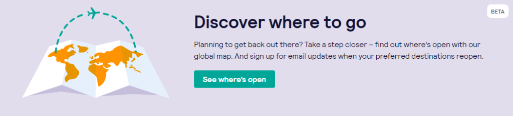
CTA: See where’s open
Type: Button
Why it works: Notice how it’s actually relevant to our current times? Skyscanner didn’t just post an announcement or booking information for travelers regarding the COVID-19 pandemic – they’ve gone a step further and updated their web copy as well as call to action to address what people need or are looking for right now: Easy to understand information on destinations that are open, partially open or closed for now based on the user’s country of origin.
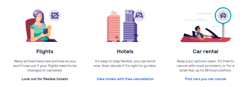
CTA: View hotels with free cancellation / Find cars you can cancel
Type: Text link
A live map showing destinations that have re-opened is only the first step of the new normal travel purchase journey. To successfully convert potential bookers, you have to convince the user to do something and in this case, to achieve that, it’s all about minimizing potential financial risks.
Updating their CTAs to “view hotels with free cancellation” or “look out for flexible tickets” or “cars you can cancel” addresses very real pain points and reduces the resistance involved in committing to a booking at this time.
It’s important to note that everything on their website has been updated to reflect the times and work together to simplify the new travel process—including updated newsletter sign-up prompts!

These updated CTAs mean you’re more inclined to take action because you get the impression they understand you and that they’ve put some work into curating a list of suitable options for you given the current travel environment. Compared with other travel or booking sites that didn’t make any changes except to post a notice, this effort makes a huge difference!
Nuud: Totally innocent, highly effective
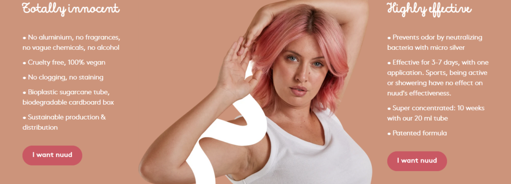
CTA: I want nuud
Type: Button
Why it works: Nuud could have used “add to cart”, “buy now”, “shop nuud now” or some variation of a similar action-oriented purchase call to action. Instead, they’ve chosen to focus on desire (“want”) and use first person (“I”) in their CTA copy. This is in contrast to omitting a personal pronoun entirely or addressing the reader as “you”. This minor adjustment personalizes the text and the action involved, putting the reader front and centre.
Plastic Oceans Canada: Eliminate single use plastics
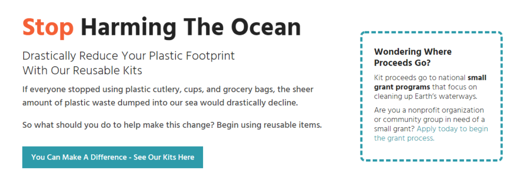
CTA: You Can Make A Difference – See Our Kits Here
Type: Button
Why it works: There are several reasons this call to action works. First, it’s consistent. On their home page, they emphasise the fact that “you can make a difference” twice. It isn’t a one-off statement—it’s repeated to really drive that sentiment home.
Second, it isn’t ambiguous. The CTA makes it clear you’re going to see their reusable item kits if you click through. In other words there’s no confusion about what awaits if you click through.
You might also like: Nudge theory: How nudging can change behaviour
Dyson: Desk fans with purification

CTA: Learn more
Type: Text link
Why it works: This is one of the more standard or common calls to action that you can find but it’s a classic for a reason: It gets the job done.
In this context, you get an introductory product description that piques your interest and has you wanting to actually learn more about the product and see if it’s something you’ll end up buying.
Monash University: Open Day 2020

CTA: Register now to experience Monash from home
Type: Hero image
Why it works: It’s short, it’s simple, and it’s straight to the point. It tells you what you need to do to participate in this year’s Open Day. That’s it.
Sometimes, you don’t need a lot of accompanying text, fancy graphics or a stand-out button to get the job done—the CTA just needs to be visible and clear.
Stella & Chewy’s: Newsletter signup
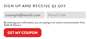
CTA: Get My Coupon
Type: Button
Why it works: Aside from the fact that “Get my coupon” in bold red grabs attention, this call to action also works because it reinforces what was promised in the headline.
Put another way, they didn’t assume that the visitor read or even remembers the headline promising $3 off, which is why they make sure to remind you of what is at stake. (Or rather, what you have to gain.)
KLM: E-mail campaign
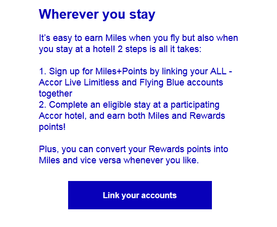
CTA: Link your accounts
Type: Button
Why it works: In order for this call to action to work, the recipient of this KLM e-mail campaign would have had to read the entire message to understand the perks of linking their Flying Blue with Accor Live Limitless accounts.
But once he’s gotten through this short message, the use of a friction-free action word – in this case “link” – makes taking action more inviting. Why? Because the word “link” doesn’t make you feel like there’s immense effort or a lot of work involved. It gives the impression of a seamless process that will instantly get you Rewards and Miles benefits.
Booking.com: See discounted deals
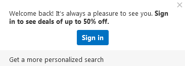
CTA: Sign in
Type: Popup
Why it works: This is a great example of where incentive and context can drive a person to take action. A sign in button on its own – without mention of the 50% deals that only become visible when you’re logged in – simply wouldn’t have the same impact. But the focus on value and your curiosity of just how amazing those deals could be motivate you to sign in.
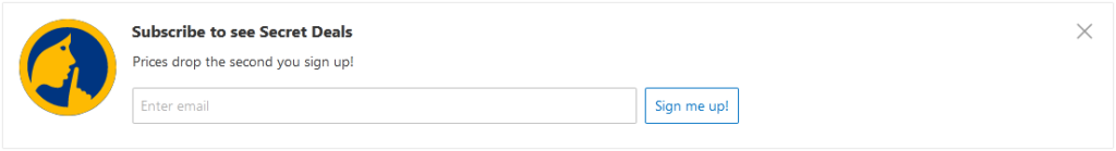
I’d also like to draw special attention to their secret deals newsletter sign-up prompt. It invites you to receive exclusive subscriber-only promotions that are guaranteed to pique your interest and make you feel special.
Ecolab: Need help?
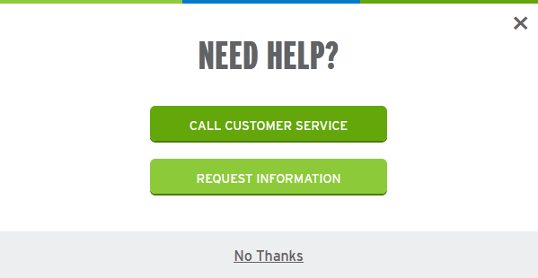
CTA: Call customer service, Request information
Type: Exit-intent popup
Why it works: Just when you’re about to leave the product page without having done anything, you’re asked if you need help. Aside from the fact that the timing and execution is excellent, I also love that you get relevant and useful options.
You can choose between two actions: call customer service or (the less intrusive, in case you aren’t ready for a phone call) request for further information.
Giving the reader two equally attractive ways to move them down the sales funnel is a win-win for the company but also aims to serve the customer’s intent for visiting the page to begin with, which is either to gather more information or to speak with a sales representative.
You might also like: How to use search intent in copywriting—and increase your conversion rate!
Surfshark: Leave no footprints
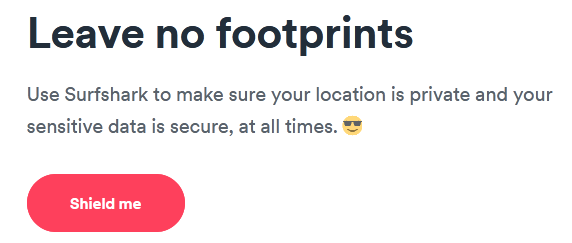
CTA: Shield me
Type: Button
Why it works: The wording of this call to action is bound to win their target customer over. These two simple – yet carefully selected words – appeal to the target audience’s concerns. That is, it resonates with those worried about online privacy and security. “Shield” is descriptive and helps you envision the protective barrier you’re getting plus the use of “me” makes it personal to the reader.
You might also like: Great examples of newsletter sign-up copy