11 fresh newsletter signup ideas and skillful strategies to grow your email list.
Newsletter signups: What’s the best way to convince readers to subscribe?
Did you know that 281 billion email messages are sent and received everyday? Here’s another fun fact: Newsletters have a higher conversion rate than social media at 4.29% vs 1.81% respectively.
Clearly email marketing isn’t just necessary—proactive email list building is an important step in forward-thinking marketing strategies. In other words, something as simple as an email list turns out to be one of your greatest assets, a digital marketing tool so powerful it impacts everything from brand awareness and recall to sales and sentiment.
But here’s the thing: Regardless of industry, there are countless newsletter options a target audience can choose from.
So how do you entice people – casual browsers, previous customers, undecided prospects with potential – to subscribe to your email list? What’s an effective newsletter subscription message? In short, how do you write a high-converting newsletter signup page?
How can you write convincing newsletter signup copy? Learn from the best with these opt-in email examples!
From creative and fresh to tried-and-tested classics; techniques to blend in and smart or disruptive strategies to stand out, this post takes a look at 11 ingenious newsletter signup examples and email opt-in best practices you can mix and match to grow your email list.
1. Cosmetics & Toiletries
Technique: Tell readers your newsletter is available for free
When to use it: When you want to lower signup resistance
Why it works: Because it’s gratis
Other takeaways:
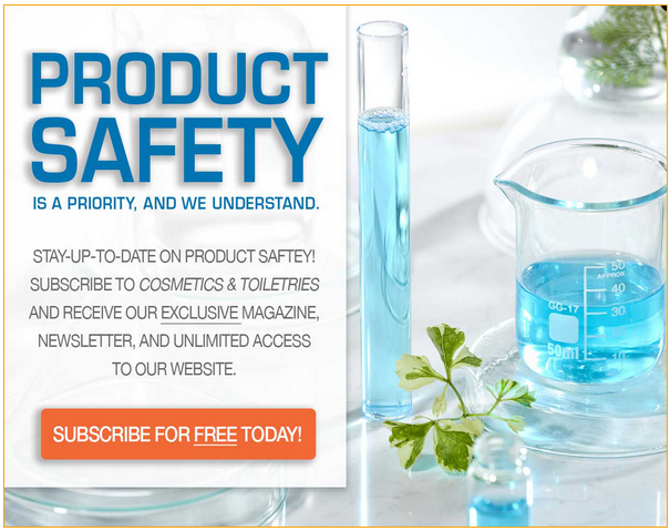
This invitation to sign up for the Cosmetics & Toiletries newsletter is first in our list of examples because these folks get everything right. In fact, they successfully combine multiple tactics for one hard-to-resist opt-in message. Here’s what I mean:
- They understand their readers’ primary concern (product safety) and offer them undeniable value in that regard:
- You can stay up-to-date on product safety;
- Receive an exclusive magazine at no cost;
- Gain unlimited access to the website.
- You are encouraged to subscribe immediately. Not tomorrow, not next week, not when you need to get the latest news—today. (Bonus points for not sticking to the typical ‘subscribe’ or ‘subscribe now’ button.)
- They use magnetic words (“exclusive”, “unlimited”, and “free”) that don’t just grab attention, they’re also hard to resist.
2. Heilala Vanilla

Technique: Opt for gated content, i.e. giving a valuable resource away for free in exchange for user data
When to use it: When there’s a lot of competition (similar newsletters) and readers need a good reason to choose you; when signups are stagnant; when you want to learn more about your readers and need an acceptable way to request personal information
Why it works: Because everyone loves a good freebie
Other takeaways:
If you want people to share their contact (or any other personal) information with you, then you need to make it worth their while. A valuable freebie, like a free recipe e-book (see above) or a useful first-aid kit for dogs checklist (see example #3), often does the trick!
3. Whole Dog Journal
Technique: Make it hard to click away
When to use it: When you want to make the user rethink their instinct to hit the X-button on your overlay
Why it works: It hits a nerve
Other takeaways:
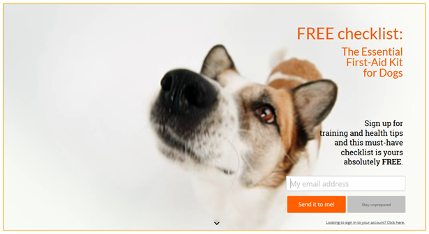
Whole Dog Journal has two brilliant tactics at play here. First is the use of side-by-side calls to action—very popular these days. In this case, the options are “Send it to me!” or “Stay unprepared”, with the latter really tapping into a dog lover’s guilty conscience.
A quick caveat: Guilt-tripping can be counter-productive (since it can leave a bad taste), so make sure to keep your statement neutral to avoid that effect. For example, there’s a palpable difference between “stay unprepared” and “no thanks, I don’t care about my dog’s well-being”. One is harmless, the other makes you out to be a bad pet parent.
Second, Whole Dog Journal opted for a dynamic email list signup prompt and it works wonders. There’s no way you can ignore this popup because the cute doggo is in video format!
4. HubSpot
Technique: Social proof – make use of impressive numbers
When to use it: When you need to be extra persuasive; when you want the subscriber to know he is in good company; when you want to show authority
Why it works: Because of the bandwagon effect, because it lends credibility, and because we trust our peers
Other takeaways:
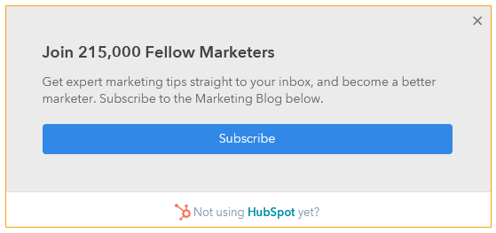
This ‘subscribe to our newsletter’ example looks simple in comparison to the previous ones but you can see that it’s incredibly well-thought-out. (And that’s all because of how things are worded.)
First, it piques your interest: Are these emails really that good that so many have signed up? Second, it implies you’re in excellent company: 215,000 fellow marketers (professionals just like you) are already on this list! Third, you aren’t getting just any old set of tips but expert marketing tips, so that you become a better marketer. Who would willingly turn that down?
5. DANI Naturals
Technique: Give people an incentive to signup for your newsletter
When to use it: When you want to attract new and old customers to sign up; when you want to nudge web visitors to make a purchase in the near future; when your audience needs extra convincing to join your email list
Why it works: We all want to save money
Other takeaways:
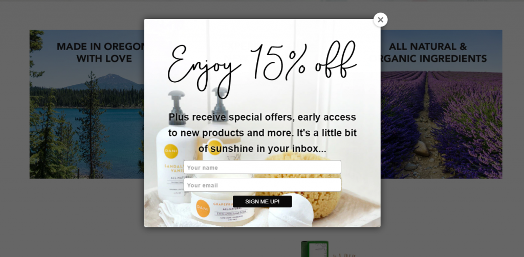
We all love a good deal, so the main takeaway here is that discounts, promo codes, and coupons work wonders in boosting newsletter conversions! In fact, according to a Data and Marketing Association report, 60% of consumers sign up for an email newsletter because they want to receive offers and sales.
In this newsletter signup example, the incentive to enjoy 15% jumps straight off the page—it’s the headline! The visitor can’t miss it. In other words, it’s good practice for whatever perk, be it a discount, free shipping, or any other benefit, to be featured prominently in your opt-in message.
6. Le Chateau
Technique: Give subscribers preferential treatment
When to use it: When you want to make your readers feel valued; when you want to tap into certain aspirational factors
Why it works: Because we like being prioritized—and we want to be the first to know about what matters to us
Other takeaways:
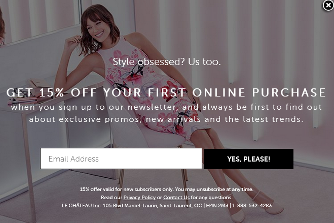
Sometimes, it’s not enough to offer discounts. Sometimes, what your audience really wants is to stay ahead of the curve. They want first dibs on special offers and they love being the knowledgeable one in their social or professional circle. If you can give them that—exclusive access, goodies, and insight—via your newsletter, the more likely your web visitors are to sign up for your mailing list.
7. The SCMP
Technique: Invite your audience to be part of something special
When to use it: When you want to give readers a sense of belonging
Why it works: FOMO (the fear of missing out)
Other takeaways:
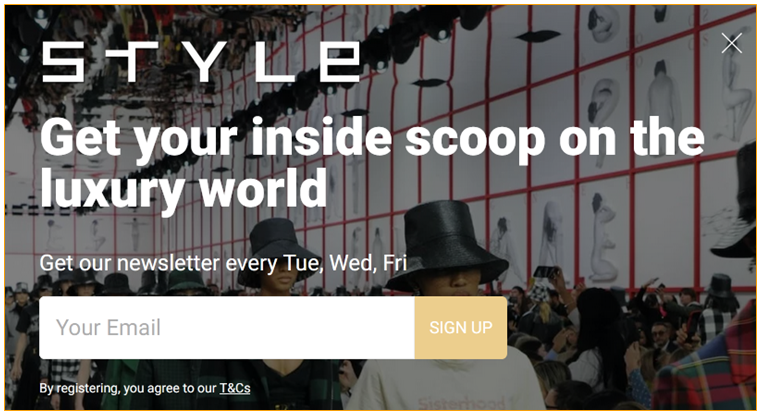
You don’t need a lengthy email sign up form to convince visitors to sign up for email newsletters; it all comes down to wording. Pick power words and trim the fat to build high-impact sentences.
For example: “Inside scoop” is so much more enticing than “latest news”. The latter is generic, the former elicits feelings. And “luxury world” indicates what type of content the newsletter will cover. You’re probably not going to read about H&M here, but it is the right place for news on Hermès.
8. Broadway.com
Technique: Let subscribers choose what they want on your newsletter signup landing page
When to use it: When you have themed newsletters or multiple email campaign categories (and you don’t want to overwhelm subscribers)
Why it works: We don’t like uncertainty or (unpleasant) surprises; because a sense of agency is important
Other takeaways:
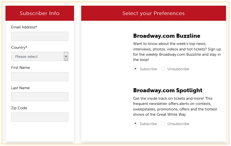
Simply put, people want to know what they’re going to get. Some people are only interested in promotional codes; others want the stories, the latest insights, and other exclusive content. That’s why it helps if you give subscribers the option to choose what kind of content they want to receive. That’s also one way to ensure that they stay subscribed—and continue engaging with your emails.
In short, email opt in best practices dictate that newsletter signup copy include a sneak peek of what to expect.
9. National Geographic
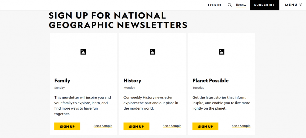
Technique: Be forthright about newsletter frequency
When to use it: When you want to rid potential subscribers of their apprehensions
Why it works: No one wants to be bombarded with marketing emails
Other takeaways:
A key deterrent to signing up for mailing lists is the concern about how often that business will email you, i.e. waking up to an overflowing inbox (that you’ll have to clean) every single day. That’s happened to me on more than one occasion. One brand inundated me with 2 to 3 emails per day; another sent me emails 3 times a week—all on the same topic! Way too much and definitely not what I signed up for, which is why, whether it’s daily roundups, weekly, or even monthly mails, it’s never a bad idea to let the subscriber know how often they’ll be hearing from you.
10. America’s Test Kitchen

Technique: Get creative with your newsletter call to action button
When to use it: When you want to show your unique personality; when you want to reinforce a message
Why it works: It grabs attention (because it’s different to what you’d normally see)
Other takeaways:
It goes without saying that you need an eye-catching headline. Equally, your newsletter subscription message is just as important for conversions. But that doesn’t mean you should be lax with your newsletter signup call to action button. “Subscribe” and “Sign up” are classic options but they don’t really pack a punch. On the other hand, “Get free access”, “Inspire me”, “Yes, I want my coupon” or other creative prompts that really speak to the motivation behind signing up for the newsletter to begin with can be what really seals the deal.
11. Raffles Hotel Phnom Penh
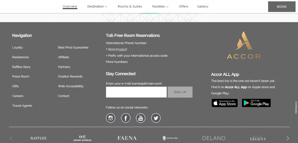
Technique: Go minimal
When to use it: When you want something simple; when you want a sign up form that blends into your website’s design; when you don’t want a disruptive experience
Why it works: Because people already know what they need to do or they had the intent to sign up for your newsletter to begin with
Other takeaways:
You don’t always have to be big or bold to land the conversion. There are times when a basic sign up form is enough to attract subscribers—especially when your brand is well-known (or high-end) and no further explanation is needed.
What should you do now?
Now that your opt in copy is sorted, here comes the hard part: It’s time to follow through with everything you’ve promised (and then some). In other words, your focus goes towards developing high-quality newsletter content and effective email campaigns. The good news: I’d love to help!
Here’s where you can read about my content writing service, these are my discounted packages (worth checking out), and the handy button below ↓ will take you straight to my contact form, where you can send me a message with the details of your project, request a quote, or ask for more information. Or you can just say hi, that’s OK too! Talk to you soon.