Effective product descriptions don’t just describe—they persuade.
If you’ve ever added something to your cart that you didn’t plan to buy, there’s a good chance the product description did more heavy lifting than you realized.
That’s no coincidence.
The best ones combine copywriting techniques with proven principles from marketing psychology, buyer psychology and behavioral economics to increase conversions.
In this article, we’ll break down real examples of great product descriptions and uncover why they work, so you can apply them to your own writing.
(These are the same principles I use when writing and optimizing product descriptions for brands across both everyday and premium categories.)
Because while tools, including AI, can help generate copy and speed up execution, they can’t replace the strategic judgment needed to evaluate whether the output is actually sound from a copywriting and marketing psychology perspective.
High-converting product descriptions still depend on human expertise—a deeper understanding of your customer, their intent, and the psychology and behavior behind their buying decisions.
Product description examples (and what you can learn from them)
Note: Brand names and products mentioned are used for illustrative purposes only. Their inclusion does not imply any affiliation, endorsement, or recommendation.
✨ Morihata: HA KO Paper Incense
When a product description (on its own) makes you want to buy something you don’t need—and didn’t even know you wanted—you know you’re reading an effective product description. 💡
That’s exactly the challenge here because this first product isn’t the kind of incense most people already understand.

It’s something totally new.
And when a product is new or unfamiliar, that means people have many questions and hesitations.
A great product description removes confusion, answers unspoken questions, and creates demand for it; it turns the product into a must-have.
Here’s how Morihata did that:
✅ They explain the origin and concept of the product.
By clearly explaining what it is (“a modern take on potpourri”), the brand removes uncertainty and makes the product feel more accessible.
There’s also a deeper signal at play here: country of origin.
When a product is tied to a place known for craftsmanship or tradition, it carries built-in associations of quality, authenticity, and care.
Highlighting origin (in this case Japan) doesn’t just inform—it elevates how the product is perceived.
✅ The product copy suggests how and where to use it.
“On your desk, in your car, near the entryway” helps the reader picture the product in their own life. And when people can see themselves using something, they’re more likely to want it because it already feels real and relevant.
✅ They give the reader more reasons to buy.
The description highlights how HA KO Paper Incense is a “welcome gift.” So, even if the reader doesn’t need it personally, they now have a second justification to add to cart: “Sophie’s gonna love this! Let me get it for her birthday.”
Takeaways:
- Great product descriptions don’t leave room for doubt, especially when the product itself is unfamiliar.
- Make what you’re selling instantly understandable and easy to imagine using.
- Bonus points if you answer common questions (what, how, where, when) before they’re asked.
🍊 Pierre Marcolini: Sicilian Orange Jam
When what you’re selling is on the pricier side for its category of products, you will have to do some extra convincing to get consumers to choose your product. After all, there may be other equally great but cheaper alternatives available.
Take jam, for example. Most of us have stood in a grocery aisle wondering if the more expensive jam is really worth it. 👀

That’s exactly what your customers are thinking about your pricey product. So why should shoppers splurge and choose you? The answer has to be evident in the description, which means it must do more than describe what you’re selling. It needs to actively reshape how the product is perceived so the price feels appropriate.
Pierre Marcolini’s description is a stellar example, and it all comes down to word choice.
✅ It shifts the product into a premium, experience-based category.
Phrases like “handcrafted Sicilian orange extra jam” and “for a moment of indulgence” make it instantly clear that this isn’t your regular supermarket jam—hence the higher price.
First, such language moves the product out of the “everyday grocery item” category into a premium space.
Once that happens, people stop comparing it to cheap jam and instead compare it to artisanal or luxury alternatives.
Second, it shifts attention away from function (something you eat on toast) toward experience (something you enjoy and slow down for).
This move toward emotional or hedonic value matters because people are more willing to pay higher prices when a product feels like an experience rather than just a utility.
✅ They reinforce the idea that this is a premium jam.
Throughout the description, phrases like “carefully selected,” “exceptionally high fruit content,” “naturally low in sugar,” and “no additives or artificial flavourings” all work together to build a consistent picture of quality.
Even without technical proof for each claim, this kind of language shapes perception. People naturally use these cues as mental shortcuts to judge whether something is high quality and worth the price.
The repetition of “clean,” “premium,” and “carefully made” signals really drive that premium image home.
✅ It increases confidence—and sets the standard.
Instead of relying on vague claims, the description gives specific details like “87% orange and yuzu pulp.”
This kind of specificity reduces doubt because it backs up the earlier claim (“exceptionally high fruit content”) and feels more verifiable compared to a general statement.
The high fruit content also acts as a quality anchor. Once customers see “87%,” it sets a reference point in their mind, making other jams feel less rich or less premium in comparison.
This subtly raises expectations and strengthens perceived value.
Takeaways:
- Premium pricing isn’t just about charging more. It’s about using positioning, language, and framing in your product copy to shift the reference point so the price feels justified rather than high.
- Great product descriptions don’t have to be long.
- Focus on the key points that matter to consumers then use strategic language to drive those points home.
🛏️ Eli & Elm: Organic Cotton Side Sleeper Pillow
When I was just starting out in this industry, poorly written product descriptions were everywhere—clunky, hard to follow, and visually exhausting, especially for everyday household items. 🤦🏻♀️
This is something I still see today when reviewing product pages: great products held back by unclear or poorly structured copy.
So when brands are more intentional with their product copy, they stand out and leave a lasting impression.

Here’s why this one works:
✅ It’s easy to read.
Instead of overwhelming the reader, this specific layout guides you through the features and benefits one by one.
Good structure—white space, clear headings, and visual elements—break up large blocks of text.
That matters more than you think.
When information is easy to scan, it’s easier to process. And when something is easy to process, it’s also easier to understand and trust.
Just one little thing…
If I were their product description writer, I’d end with “Made in USA” rather than “Organic Cotton.”
This order works better because it follows how people logically evaluate a product—starting with relevance (side sleeper design), then personalization (custom firmness), and finally the materials (organic cotton) that shape the experience.
Ending with “Made in USA” keeps it as a credibility boost, rather than breaking up the flow of comfort-focused details.
✅ There’s no jargon.
Everything is written in a way that anyone can understand. No technical terms, no overly complicated explanations.
This is important because complex language creates hesitation. (When people have to stop and interpret what something means, they become less confident in their decision.)
Simple language does the opposite—it reduces friction, which makes it easier to convert a looker into a buyer.
✅ It was written with a very specific type of customer in mind.
The copy focuses on real, familiar problems that side sleepers actually deal with, and explains how the pillow is designed to solve them.
They’re not just describing features—they’re showing that the brand understands the customer’s experience. That sense of being “seen” makes the message more convincing.
It also includes subtle reassurance, like referencing what “side sleepers often agree” on, which adds social proof.
Takeaways:
- Words matter, but so does presentation.
- The way information is structured—how it flows, how it looks, and how easy it is to follow—has a direct impact on how people feel about the product.
- Great product descriptions sell relief from problems real people have.
🍳 Zoie + Chloe: 100% Silicone Family Size Steamer
We just talked about the importance of presentation when it comes to product descriptions. This example shows another really effective approach: using bullet points first, followed by a short paragraph for extra detail.

It might seem like a small or even insignificant formatting choice, but there are smart reasons behind it. 🧠
Here’s why this approach works so well.
✅ It’s made for quick scanning.
The bullets create initial interest, while the paragraph adds depth, context, and reassurance—helping move the reader from curiosity to confidence.
Once the reader knows the product fits their needs, the detailed paragraph reinforces their decision and makes it feel easy to commit.
This is a structure I often recommend because it consistently performs well across different types of products and audiences.
✅ It reduces cognitive load—the amount of mental effort it takes to understand something.
Long blocks of text increase mental effort, which can lead to hesitation or disengagement. That’s detrimental to conversion.
Breaking information into bullet points makes it easier for the brain to process and retain, so the product feels simpler and less overwhelming.
✅ It caters to multiple reading styles.
Some people only want the key points, while others need more detail before making a decision. This format works for both, making the product more accessible to a wider audience.
Those who want to scan can quickly pick up the key benefits without having to read a full paragraph—extra useful when people are browsing or comparing products.
For readers who want more detail, the paragraph gently reinforces the benefits in context, helping confirm that the product is the right fit.
Takeaways:
- Strong product pages don’t assume how people will read—they support both scanners and detail-seekers.
- Structure is a conversion tool, not just formatting!
- Smart formatting builds persuasion in layers.
🍚 Zojirushi: Induction Heating System Rice Cooker
Some products feel complicated because they’re hard to understand at first glance. 🧩 But confusion is usually a presentation problem, not a product problem.
These guys get that, which is why their product description is all about “show and tell.”

As you can see, their product description includes a graphical breakdown of what makes their rice cooker great. And that’s good for business because:
✅ It removes ambiguity by showing exactly what the copy is referring to.
When text is paired with visuals, there’s far less room for misinterpretation.
Instead of having to picture or decode what something means, readers can see it instantly. This removes uncertainty—one of the main reasons people drop off or ignore product pages.
✅ It shows what the customer is actually paying for.
Visual breakdowns show what’s included in the purchase. In this case: rice measuring cups, rice spatula, spatula stand. This actually helps justify the price, too.
✅ It requires less reader effort.
When information is shared across words and images, it’s easier for the brain to process. Faster comprehension typically leads to more confidence in the buying decision.
Takeaways:
- Visuals are a powerful conversion tool for higher-consideration products because they reduce uncertainty and make value easier to grasp at a glance.
- Great copy doesn’t work alone—it needs great visuals to strengthen the overall persuasive impact of the message.
- When information includes visuals, it’s easier to understand and trust.
🧸 Bella Luna Toys: Senger Organic Cotton Puppy
How sweet is this description? 🥰

It’s cute, fun, and full of personality—without sacrificing important information. That aside, this is a great example of product copy that quietly does a lot of work under the surface. And when I say a lot, I mean a lot:
✅ It leads with emotion, not specs.
“Arf! Arf!” and “soft and adorable” immediately sets a playful, warm tone. Instead of starting with materials or features, it taps into emotion first, which is exactly how most purchase decisions begin—especially for gifts or children’s products.
✅ They sell the outcome, not just the product.
“…sure to become your child’s inseparable companion” paints a clear picture of what life looks like after the purchase. This shifts the focus from what it is to what it means. Helping the reader imagine the end benefit increases desire.
✅ It builds trust through curation and authority.
“We’ve carefully selected this… from this German company” positions the seller as a curator, not just a retailer. That implies the reader doesn’t have to do research because they’ve done it for you.
✅ It reinforces safety and values—key for their audience!
Repeated mentions of organic cotton, organic lambswool, child-safe, and eco-friendly directly address what parents care about most. The repetition isn’t accidental—it anchors the product in safety + quality + ethics, which reduces perceived risk, something that’s crucial for this audience.
✅ The description makes the product feel real.
Details like “creamy-white with light brown markings,” along with clear material descriptions, make the product feel tangible and real. The descriptive language makes it easier to visualize—even if the product image doesn’t load.
This is especially important in eCommerce, where shoppers can’t physically touch or interact with the item.
✅ There’s a subtle call to action (CTA) with personality.
“Available for adoption today!” is a clever, on-theme CTA that doesn’t feel salesy. Instead, it feels playful and emotionally aligned with the product.
The soft CTA plus anthropomorphism also make the product feel alive and lovable. Pure genius!
✅ There’s strategic use of bolding.
The highlighted words do triple duty. They:
- Help skimmers quickly spot important keywords;
- Reinforce core selling points (like “organic” and “safe”);
- Increase the chances that readers stay engaged and keep reading.
This visual hierarchy guides attention to high-value terms.
Takeaways:
- You don’t have to choose between personality and professionalism—great copy does both while building trust.
- Personality makes your brand feel more human, engaging, and memorable.
- Great product copy layers emotion, clarity, and structure to guide buyers toward a decision.
🧴 KLEN: Anti-dandruff shampoo
This next description works because it is logic-first, clarity-heavy, and trust-driven. 🤝

Instead of selling emotion, it sells confidence through transparency, structure, and proven functionality—which is exactly what shoppers want in problem-solving products like anti-dandruff shampoo. Here’s exactly how the product copy does all that in such few words:
✅ It opens with a clear problem-solution hook.
“The right solution for dry, itchy scalp and dandruff control” immediately tells the reader: this is for me if I have this problem. There’s no fluff—just direct relevance.
✅ It translates science into benefits.
Each ingredient is named and immediately tied to an outcome (e.g., “reduces flakes,” “cooling effect,” “nourishes scalp”). This bridges the gap between technical formulation and real-life results.
✅ It’s refreshingly transparent.
Not long ago, most shoppers didn’t think deeply about what was in their shampoo; only scent, function, and price mattered.
But times have changed.
Customers now want to know what they’re putting on their skin—or in their hair—and if all those ingredients are safe or even necessary.
Listing full ingredients (even complex surfactants and preservatives) builds trust. Such openness signals: nothing to hide, clinically formulated, safe use. This is especially important in personal care products.
Takeaways:
- Transparency builds trust and confidence, especially as consumers increasingly expect clear, honest information about what’s in the products they use.
- People don’t buy ingredients—they buy outcomes, so effective copy always translates technical details into clear, real-world benefits.
- Strong product copy also acts as a filter, speaking directly to a specific need or problem and naturally attracting the right audience while weeding out those it isn’t for.
🍨 Häagen-Dazs: Crispy Layers
Not all great product descriptions rely on logic—some win purely on desire.
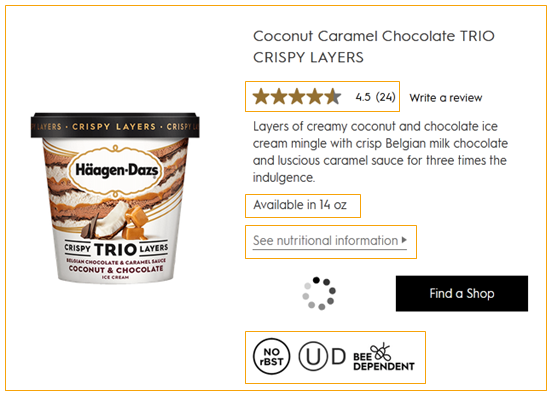
If you weren’t hungry for ice cream before, I bet you are now. 🤤 (And that’s a sign of effective copy!) Here’s how these guys managed to get your mouth watering for coconut caramel chocolate ice cream—in just one sentence!
Here’s how they do a lot with very little:
✅ They’re selling indulgence.
The phrase “three times the indulgence” positions the product as an experience, not just a dessert. So it’s not competing on “flavor” alone—it’s competing on richness, luxury, and premium satisfaction. This is classic premium positioning with ingredient prestige (it’s hormone-free, bee-dependent, and uses “Belgian milk chocolate”).
✅ It uses vivid, sensory language.
Language like “creamy coconut,” “crispy layers,” “luscious caramel,” and “mingle” force the brain to simulate eating the product.
That mental simulation is powerful—it literally creates craving before purchase. The result is that the reader goes from “I see it” to “I want it!”
This is especially effective for impulse-driven categories like ice cream, where emotion overrides logic.
✅ It’s tightly engineered to do a lot with very little.
This description works because every word earns its place. In one sentence, it:
- Establishes texture (creamy, crispy)
- Establishes flavor complexity (coconut + chocolate + caramel)
- Establishes quality cues (Belgian chocolate)
- Reinforces indulgence as the core benefit
It’s a masterclass in dense sensory stacking without clutter.
Takeaways:
- Focus on sensory-driven language (vivid, texture- and flavor-based words that help readers mentally experience the product) to trigger desire.
- Stack benefits and quality cues in a single flow.
- Keep it simple, but strategically dense; aim for clarity and impact over length.
🌶️ Terre Exotique: Red Kampot Pepper
Most people don’t think twice about pepper—it’s just something you sprinkle on food without much thought. But this product description is a great example of elevating an everyday product through smart, minimal copy.

Here’s why this 33-word short description is so effective:
✅ It leverages contrast to stand out.
Because pepper is typically seen as a low-involvement, everyday item, this elevated description creates a strong contrast—which grabs attention. Such pattern interruption breaks expectations making people stop and take notice.
✅ It leans into descriptive language.
They tap into the curiosity gap and sensory imagination to do two things at once:
- Tell you what to expect (flavor);
- Craft an unfamiliar but appealing description that makes people want to try it.
Flavor notes like “fruit compote,” “vanilla,” and “candied citrus” help the reader imagine the taste, even if they’ve never experienced anything like it before.
The result? Instant intrigue: “Pepper can taste like that?!” 🤯
✅ It educates without sound pedantic or “better than.”
Instead of a long explanation, it gives just enough guidance: “Perfect for fish, shellfish, and poultry.” This simple line opens the door to new possibilities without requiring any extra effort on the shopper’s part.
Takeaways:
- Don’t assume product knowledge—guide the experience, especially if you want to spark new interest.
- Clarity reduces hesitation; people are more likely to try something new when they know what to do with it.
- Keep it short, but make every word serve a purpose.
📸 Leica: V-Lux 5
Most camera descriptions tend to fall into one of two extremes: overly technical spec sheets or vague, lifestyle-heavy fluff. This one strikes a rare balance. It manages to position the product, highlight its capabilities, and sell the experience—all while making complex features feel clear, relevant, and easy to understand. 👍🏻

This is a great example of premium tech product copy! It blends aspiration, performance, and practicality in a way that appeals to both enthusiasts and serious buyers.
Let’s break down how they do it.
✅ It makes a complex product easy to understand.
A potential customer can’t appreciate how great a product is—let alone decide to buy it—if the description is overly complicated or filled with industry jargon.
That’s why strong product copy simplifies without dumbing things down.
This balance is one of the most common challenges I see with technical products, and it’s one of the biggest opportunities to improve conversions.
Leica uses simple, accessible language to explain what the camera does, so even someone new to photography can quickly grasp its value.
✅ The description balances simplicity with technical depth.
What makes this especially effective is that it doesn’t only simplify. It layers in technical details for those who want them.
- Beginners understand: “versatile,” “no need to change lenses,” “great for travel”
- More experienced users appreciate: sensor size, autofocus speed, 4K video, lens specs
This description works so well because it meets its audience where they are:
- Newer hobbyists understand the benefits clearly
- More experienced users can validate the specs
It’s a perfect example of audience-aware copywriting in action.
✅ It positions the product clearly as an all-in-one solution.
Decision simplification and positioning are at play here.
Calling it the “most versatile high-end compact camera” and an “all-rounder” immediately frames its value.
It also answers an important question: “Why this over others?” (Because it does everything!)
✅ It translates features into real-world benefits.
Instead of dumping specs, it connects them to outcomes:
- Zoom range → no need for extra gear
- Sensor → clearer, more detailed images
- Autofocus → speed and responsiveness
This helps buyers understand not just what it is, but why it matters.
✅ The product copy highlights convenience.
“Avoiding the need for changing lenses and packing additional equipment” speaks directly to a real pain point and, at the same time, offers the solution. In this way, it sells ease, portability, and simplicity—especially appealing for travel.
✅ It uses structure to make technical content digestible.
Breaking the description into labeled sections (sensor, autofocus, video, etc.) makes it easy to scan and absorb, so that even a spec-heavy product feels manageable.
✅ The description blends performance with aspiration.
Phrases like, “your photographic journey,” “life’s unexpected moments,” and “great outdoors” elevate the product beyond specs into experience and identity, which is an excellent example of using identity-based marketing in copywriting.
Takeaways:
- If people can’t quickly grasp what your product does and why it matters, they won’t buy. Clarity always wins!
- What counts as “great” depends on who’s reading—understanding your customer is what allows you to strike the right balance between clarity, detail, and persuasion.
- Write for different levels of awareness and expertise.
Most product descriptions don’t fail because of bad products. They fail because the value isn’t communicated clearly enough.
Here, you’ve just seen what great product descriptions can do. Now imagine every page on your site working this hard.
From everyday essentials to premium brands, I write product descriptions that turn browsers into buyers—using the same principles you’ve seen here.
👉 If you need product copy that doesn’t just describe your product but actually sells it, let’s talk.