These online store problems could be the culprit behind slow, low or no digital sales.

Why are your online sales so low?
Are you stumped as to why your website’s sales are lagging? Or worse, are you growing increasingly concerned about low or no sales?
Modesty aside, you know you have great products. You’re also active online; you have an e-commerce website to serve as many customers as possible, particularly digital natives.
So where are all the online shoppers? Why aren’t people buying from you? What exactly are you doing wrong?
Frankly, there could be many contributing factors behind why you aren’t selling more online. Having said that, low digital sales can often be traced back to careless oversights that end up costing you big time. You don’t think they’re that important but in actuality they deter customers—and consequently eat into revenue.
Those common e-commerce mistakes, no matter how small they may seem, turn into very real challenges experienced by many, if not most, online sellers.
Fortunately, these issues can be prevented if you just know how to do so. Hence the following list of e-commerce mistakes to avoid, which I hope you’ll find useful in troubleshooting your way out of the low-sales conundrum.

Common e-commerce mistakes costing you traffic and sales!
Mistake #1: Insufficient research
One of the most common e-commerce mistakes you can make is believing that since you would buy what you’re selling, then everyone else will too.
For most online sellers (and resellers), though, the reality is often quite different—it’s how you can end up with inventory that simply won’t move.
Why does this happen? For one very simple reason: Not enough research.
Research is the cornerstone of any successful business. Without it, you’ll struggle to craft a viable sales strategy. So what should you look into before you launch a product or set up an online store?
Among others:
- Assess your products’ prospects.
Is there a need or desire for your what you’re selling? - Research your industry.
How is it faring and where is it going? - Analyze your competition.
Who and what are you up against? - Get to know your buyer segments.
Who are your potential customers? What makes them tick?
Mistake #2: Your website is outdated
When was the last time you shopped on an ugly website? You know the kind I’m talking about:
- Images don’t load anymore; all you see are annoying red x marks where photos ought to be.
- Buttons are either nowhere to be found or all over the place—in various sizes and colors!
- The design is practically obsolete. It clearly hasn’t seen an update in the last few years.
Developing a website and then failing to maintain it is one of the most common e-commerce mistakes out there. It’s also one of the deadliest for an online business!
First, outdated websites are bad for SEO. Second, they give off a terrible first impression. Third, they leave people questioning your professionalism.
Is this company even still in business? Or does the owner simply not care? It doesn’t matter because no one is going to stick around to find out. Fact is, no one wants to engage with an unattractive website—even if it belongs to a legitimate business.
The result: A double whammy of lost traffic and lost sales.
Mistake #3: Unpleasant user experience
Good looking is one thing; customer-friendly is another. In other words, aesthetics aside, it’s just as important to make sure shoppers don’t have any difficulties using your website.
Here’s what you need for a seamless user experience:
- Practical navigation
Visitors should be able to get around easily. They should also be able to find what they’re looking for quickly. - Responsive design
Your website must be mobile-friendly. Pages need to load properly regardless of device. - Search capability
Allow users to easily search for products with an on-site search engine specifically developed for e-commerce sites. - Personalized recommendations
Show relevant recommendations based on a user’s unique on-site behavior (e.g. past searches) or based on what other customers viewed / bought on the site. - Limited popups
Keep these to a minimum and make sure any popups you deploy are actually relevant. - Speed
Your pages should be fast-loading and not prone to crashing—most especially during the checkout process!
Mistake #4: No trust signals
Trust signals are the little details that give users the confidence to engage with—and complete transactions on—your website. Without them, the legitimacy or security of your online shop might be questioned.
For e-commerce sites, you need trust signals like:
- An encrypted connection: SSL certificate, security seals, and / or trust badges like the Norton Seal;
- Secure payment system;
- A customer-oriented privacy policy;
- Contact information;
- High-quality product photos;
- Social proof like product ratings and real reviews.

Mistake #5: Web copy that’s not optimized for search
For online stores, the internet is a fiercely competitive market space where discoverability plus standing out are matters of life and death. Fact is, if your website doesn’t show up in search results, then you simply don’t exist—customers can’t find you.
Although there can be many reasons for not ranking highly on search engines, that doesn’t mean you should throw your hands in the air and give up.
There are still many improvements you can make to change things for the better. First is building an SEO-friendly website (see mistakes #2 and #3) and then populating your pages with high-quality web copy that also matches user intent.
It’s no easy task but you don’t have to do it alone—you can always seek expert guidance from a seasoned copywriter.
Mistake #6: Bad product copy
Do your product pages show up for relevant search terms? Are your product descriptions clear and complete? Is your product copy persuasive?
If you answered “no” or “I’m not sure” to any of the above, then you have a lot of work to do starting with improving your product descriptions. Yes, that includes rethinking your keyword strategy.
For example: If you sell specialty shoes, it’s easier to reach your target customers with terms like ‘orthopedic shoes’, ‘shoes for flat footed’, ‘shoes with arch support’, and ‘slip resistant work shoes for women’ rather than with broad keywords like ‘shoes’ and ‘women’s shoes’, which are incredibly difficult to rank highly for.
Here’s what that can look like in practice:

Mistake #7: A barely-there USP
There are tons of online stores with a similar assortment of products to choose from. Why should shoppers buy your brand or shop on your website?
In other words, if you want people to buy from your online store, you need to give them good reason to. So what makes your digital outlet better than the alternatives?
For example:
- Do you have the best return policy?
- Are you the only one with city-wide same day delivery?
- Do you offer the widest selection in a specific product category?
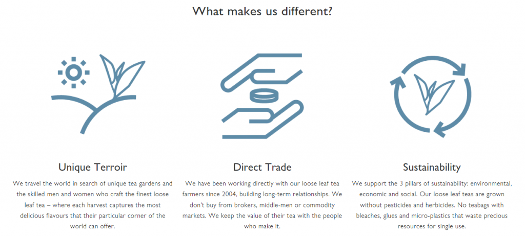
Your unique selling proposition (USP) should be crystal clear—and prominently displayed. Here’s an excellent real-world example:


Here’s another example: Let’s say you curate an exclusive collection of hard-to-find specialty teas. You would highlight how tea aficionados no longer have to search high and low, place orders on multiple websites, or trek around town visiting multiple tea shops just to get their hands on the world’s finest teas. They can now easily get it all in just one place – your website!
Mistake #8: People need to create an account to buy from you
If you want to lower cart abandonment rates and increase conversions, then make sure shopping from you is neither complicated nor too time-consuming. That means it shouldn’t be a requirement to create an account (or sign in to an account first) in order to complete a purchase.
Keep in mind that the only time shoppers will be amenable to a complex purchase process is if what they’re buying is high-involvement or perceived to be of high value.
Mistake #9: Payment errors
Did that heading make you sweat?
Exactly! No one and I mean no one, whether seller or shopper, wants to experience payment failures. The stress and uncertainty involved in such scenarios are surefire ways to lose customers—fast!
If a buyer has any doubts as to whether an order was actually placed; if the payment was processed; or if that final click really went through, then you can pretty much say goodbye to any repeat purchases. He’s not coming back any time soon!
Be warned: Other than an ugly website, encountering payment processing issues is one of the WORST of the most common e-commerce mistakes you can possibly make. It will kill your business, so prevent at all costs!
Mistake #10: Hidden fees
Customers hate two things: Hidden fees and the added work of having to calculate tax or estimate add-on charges while they’re shopping. As far as shoppers are concerned, that’s your job.
To be clear, that means:
- Display final prices—no surprises upon checkout.
- Be up front about any extra charges, e.g. shipping, insurance, customs fees and import duties.
Mistake #11: No follow up
It’s important—and good manners—to show appreciation post-purchase. Equally, you want to give the shopper all the information he may need to keep track of his order.
In short, you need post-transaction email campaigns – whether automated or manual – that should include invoice / payment confirmation, details of the customer’s purchase, and package tracking number.
You can also follow that up with emails informing the customer of his order’s delivery status, e.g. when it gets dispatched and that it was successfully delivered. You may even request for the customer’s feedback on the product, i.e. a review.
Mistake #12: A difficult return policy
Did you know that 67% of shoppers read a store’s return policy before making a purchase? That means, one way to convince people to buy from you is to have a flexible and transparent return policy. It has to be customer-oriented and fair otherwise shoppers will just go shop elsewhere.
Mistake #13: Poor customer support
It’ll be hard to convince people to buy from you if you don’t offer outstanding customer service. It goes without saying then that it must cover pre- and post-purchase needs.
What if someone wants to know more about a specific item? What if his order didn’t arrive when it was supposed to? Where does he go if he’s not 100% satisfied with the product? You need to give customers an outlet for support.
You have many options for this: Write an extensive FAQ; provide convenient ways to get in touch with you e.g. through a contact number and email address; or via live chat either directly on the site or through social.
And there we have it, a rundown of common e-commerce mistakes that chip away at your earning potential. How many have you been making? And which changes will you start with? I’m just an email away if you need any copywriting help.